
GeoSpark UX/UI Design
Context
Master’s Level User Interface (UI) Design Course @ UofT
Role
UX/UI Designer
Tools
Figma
Process
User Persona, User Journey Map, User Story Board, User Flow, Wireframe, Mid- and High-Fidelity Prototypes, Usability Testing, Design Iterations, Responsive Design, Design System
⚠️️ PROBLEMS
What Problems Are Travellers And General Map Users Facing?

Reminder Blindness
People often forget what they need to do despite putting on reminders or notes.

Can't Remember Visits
People can hardly recall what they have done at the places they went.

Paid Review Problem
Many reviews from social media were fake and/or sponsored.
🗝️ SOLUTION
What Solutions Did I Applied In GeoSpark?

Location-Based Reminder
Customize notification based on user’s time and location.

Location-Based Social Media
Drop a spark, then track and share memories at certain locations.

Highlight Friends Review
Usability study showed that people trust reviews by their friends more.
🏆 IMPACTS & KEY TAKEAWAYS
What Did The Potential Users Say? What Did I Learned?
75%
of participants claimed that they would like to use GeoSpark after trying out the prototypes.
BUSINESS MINDSET +
Product Uniqueness
I combined design thinking with business thinking to highlight product uniqueness compared to global reputable products like Google Maps and Apple Maps.
TECHNICAL SKILL +
Responsive Design
I learned how to create responsive screen designs using variables.
TECHNICAL SKILL +
Auto Layout
I learned how to set up comprehensive and consistent auto-layouts to ensure readability and accessibility.

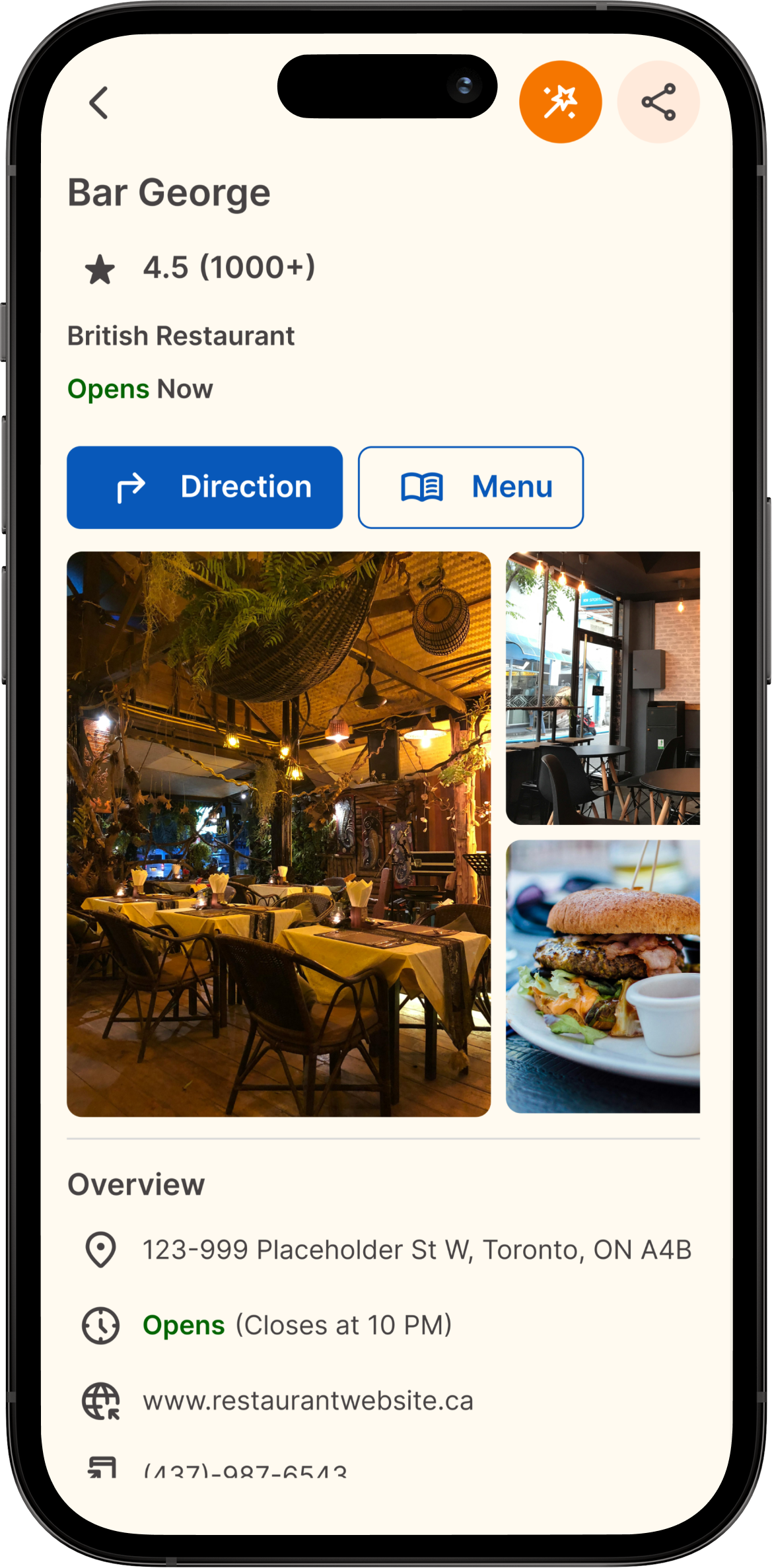
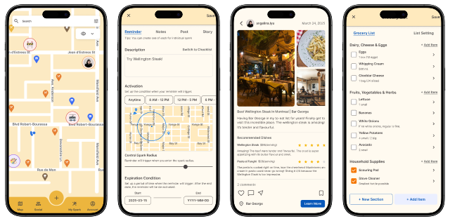
📱 FINAL PROTOTYPES
📖 STORYBOARD
🙋♀️ USER PERSONA & AS-IS USER JOURNEY MAP
Let’s Meet Christina!
To better understand and empathize potential audience, I created a user persona and a scenario using a user journey map to describe a potential challenge.
️📐 DESIGN GUIDELINES
What Features Can Help Christina?
Based on the User Persona and As-Is User Journey Map, I ideated the following rules and recommendations to follow during the design phases.

Social Implementation
The system needs to provide socialization features that allow users to share content and experiences based on location.

Note-Taking/Reminder
The system needs to allow users to generate notes or reminders for later reference.

Local Guides
The system needs to provide local recommendations or reviews from real customers’ experiences.
➡️ USER FLOW
How Will Christina Use These Features? Prepare For Usability Test!
To get prepared for the upcoming usability testing, I drafted two user flows of how users will navigate the application successfully.
📖 MID-FIDELITY PROTOTYPE & INTERACTION STORYBOARD
🎨 COLOUR ITERATIONS
WCAG Accessibility Guideline
Visual Accessibility Issue
However, after testing out in prototype, the contrast between foreground and background was insufficient. Visual minority users or outdoor users under sunny days may not be able to see carefully.
Color Choice
To highlight the warmth of Sparks and people's relationship, I chose orange and yellow for the colour scheme.
WCAG Accessibility Guideline
Colour Scheme Iteration
To resolve this accessibility issue, a lighter yellow colour is chosen for the background with a darker foreground. The primary button colour is replaced with a complementary colour of blue to ensure both accessibility and aesthetics.
💬 USABILITY TESTING & PEER/EXPERT CRITIQUES
How Do Users Like Christina React To GeoSpark?
To evaluate the usability and intuitiveness of GeoSpark, I conducted four usability testings and four peer/expert critiques. I analyzed the results and findings using affinity diagraming.
📱 HIGH-FIDELITY DESIGN & DESIGN ITERATIONS
3 out of 4 participants
Like Social Features
“I like how your friends’ review go before the public reviews because I usually trust my friends’ opinions more than opinions from strangers.”
1 out of 4 experts
Highlight Social Feature
“The direction and navigation screens are too similar to Google Map and Apple Map, highlight what makes GeoSpark unique.”
2 out of 4 participants
Extend Spark Features
“I like how it has multiple different spark types, giving it the potential of bringing convenience.”
2 out of 4 participants
Like Location-Based Reminder
“I like how you can receive reminder when you are nearby the place because I often do not remember what to buy when I was nearby.”
1 out of 4 participants
Spark Settings Iteration
“I don’t think I will touch the spark settings because I don’t know what would happen.”
2 out of 4 participants & 2 out of 4 peers/experts
Resize Location Pins
“The pins on the map are a bit too small”
2 out of 4 participants
Adjust Alert Display
“I don’t like how the alert message pop up in the middle of the screen because if this message pops up midway while I’m driving, I’ll panic.”
📱 NEW FEATURES & SCREENS
New Feature
Spark Collections
To help users categorize sparks, I added the spark collection feature.
New Feature
Grocery List
“I often forget what grocery or item to buy when I pass the store on the way”
🗺️ AS-IS USER JOURNEY MAP
How Would Christina’s Journey Change With GeoSpark?
To help communicate the impacts GeoSpark can bring to potential audience like Christina, I created an As-Is User Journey Map with the same story background. But this time, GeoSpark can help Christina solves her challenges!
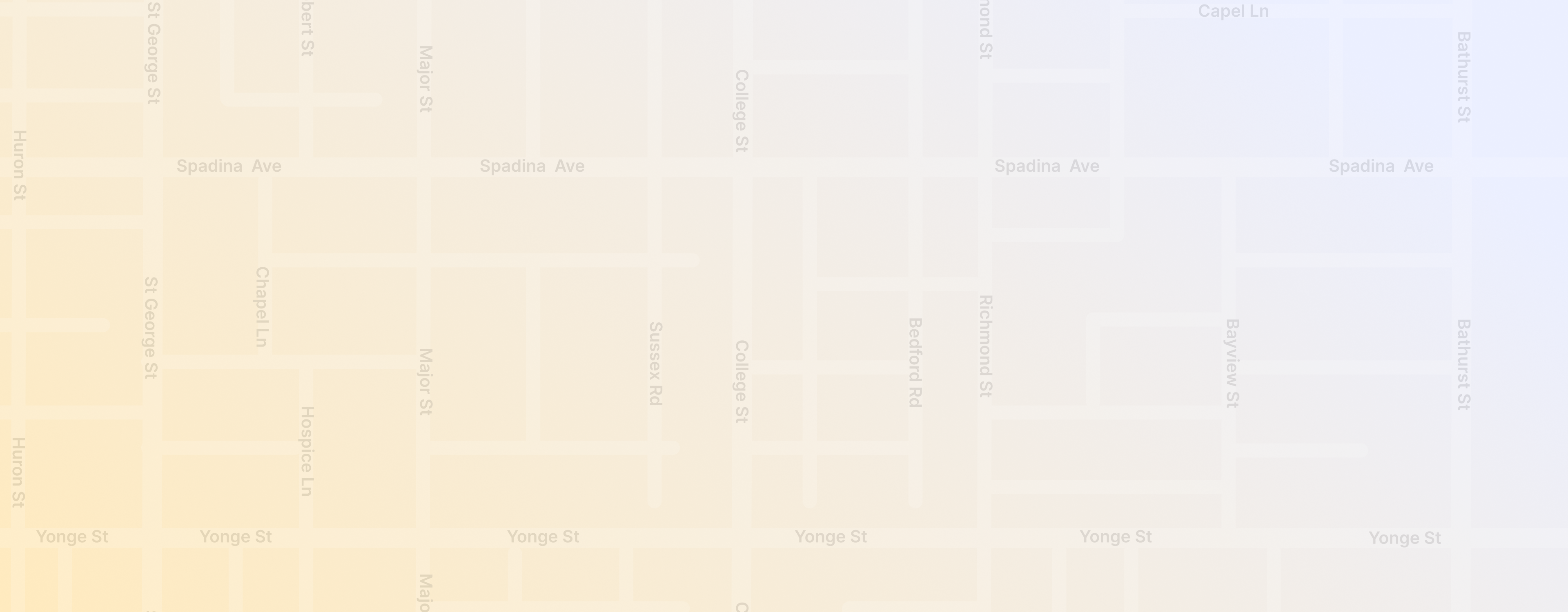
💻 RESPONSIVE DESIGNS
What If Users Are Not Accessing GeoSpark Via Mobile Phones?
To ensure accessibility for users using different hardwares, here is an example of how GeoSpark will respond to different screen sizes.
Tablet View
Mobile View
🧩 DESIGN SYSTEM
To Ensure Design Consistency...
I established a design system from scratch and set up variables
GeoSpark UX/UI Design
Context
Master’s Level User Interface (UI) Design Course @ UofT
Role
UX/UI Designer
Tools
Figma
Process
User Persona, User Journey Map, User Story Board, User Flow, Wireframe, Mid- and High-Fidelity Prototypes, Usability Testing, Design Iterations, Responsive Design, Design System
⚠️️ PROBLEMS
What Problems Are Travellers And General Map Users Facing?
Reminder Blindness
People often forget what they need to do despite putting on reminders or notes.

Can't Remember Visits
People can hardly recall what they have done at the places they went.
Paid Review Problem
Many reviews from social media were fake and/or sponsored.
🗝️ SOLUTION
What Solutions Did I Applied In GeoSpark?
Location-Based Reminder
Customize notification based on user’s time and location.
Location-Based Social Media
Drop a spark, then track and share memories at certain locations.
Highlight Friends Review
Usability study showed that people trust reviews by their friends more.
🏆 IMPACTS & KEY TAKEAWAYS
What Did The Potential Users Say? What Did I Learned?
75%
of participants claimed that they would like to use GeoSpark after trying out the prototypes.
TECHNICAL SKILL +
Responsive Design
I learned how to create responsive screen designs using variables.
TECHNICAL SKILL +
Auto Layout
I learned how to set up comprehensive and consistent auto-layouts to ensure readability and accessibility.
BUSINESS MINDSET +
Product Uniqueness
I combined design thinking with business thinking to highlight product uniqueness compared to global reputable products like Google Maps and Apple Maps.
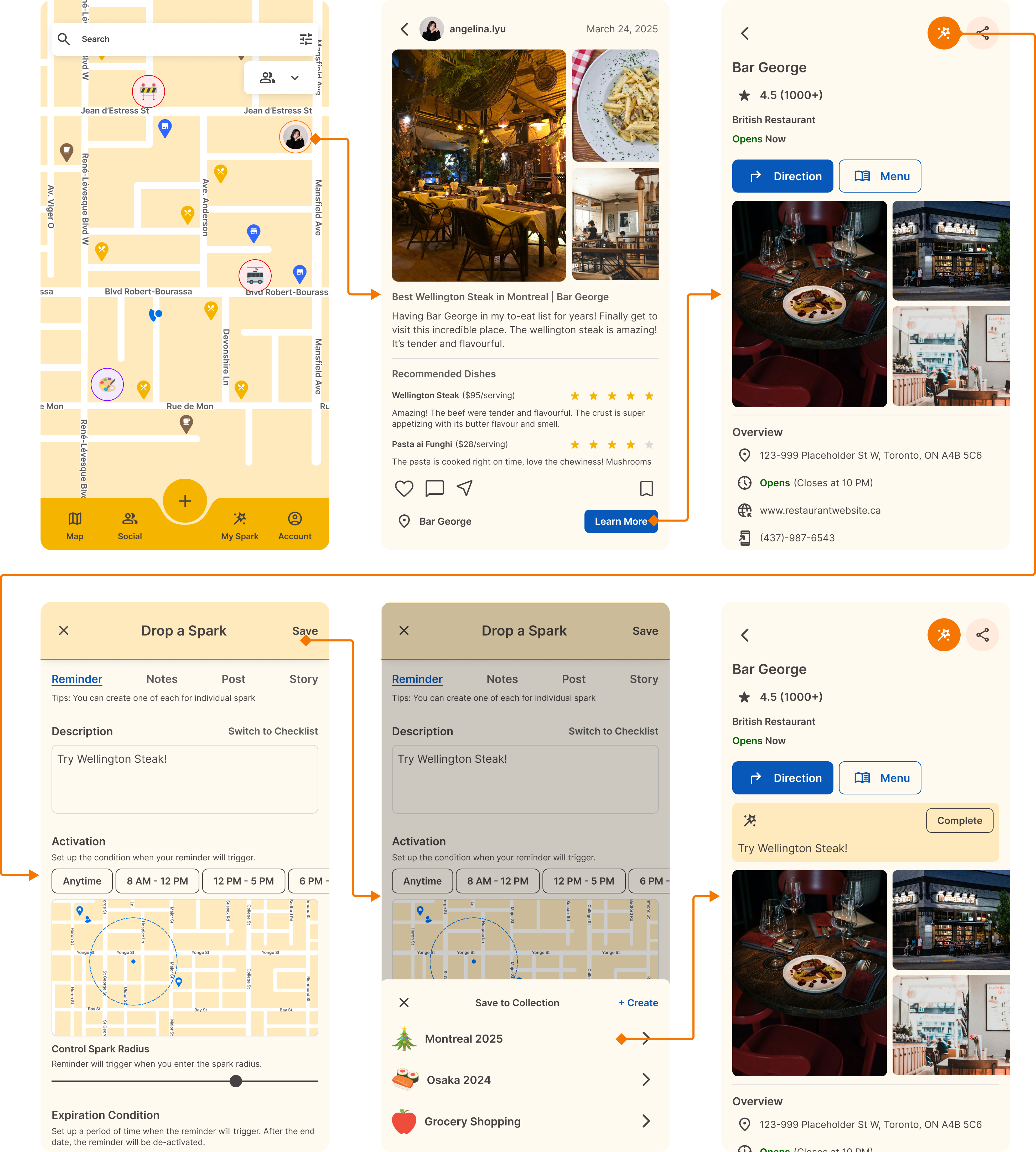
📱 FINAL PROTOTYPES
📖 STORYBOARD
01. Drop a Reminder
🙋♀️ USER PERSONA & AS-IS USER JOURNEY MAP
Let’s Meet Christina!
To better understand and empathize potential audience, I created a user persona and a scenario using a user journey map to describe a potential challenge.
️📐 DESIGN GUIDELINES
What Features Can Help Christina?
Based on the User Persona and As-Is User Journey Map, I ideated the following rules and recommendations to follow during the design phases.
Social Implementation
The system needs to provide socialization features that allow users to share content and experiences based on location.
Note-Taking/Reminder
The system needs to allow users to generate notes or reminders for later reference.
Local Guides
The system needs to provide local recommendations or reviews from real customers’ experiences.
➡️ USER FLOW
How Will Christina Use These Features? Prepare For Usability Test!
To get prepared for the upcoming usability testing, I drafted two user flows of how users will navigate the application successfully.
📖 MID-FIDELITY PROTOTYPE & INTERACTION STORYBOARD
🎨 COLOUR ITERATIONS
Color Choice
To highlight the warmth of Sparks and people's relationship, I chose orange and yellow for the colour scheme.
WCAG Accessibility Guideline
Visual Accessibility Issue
However, after testing out in prototype, the contrast between foreground and background was insufficient. Visual minority users or outdoor users under sunny days may not be able to see carefully.
WCAG Accessibility Guideline
Colour Scheme Iteration
To resolve this accessibility issue, a lighter yellow colour is chosen for the background with a darker foreground. The primary button colour is replaced with a complementary colour of blue to ensure both accessibility and aesthetics.
💬 USABILITY TESTING & PEER/EXPERT CRITIQUES
How Do Users Like Christina React To GeoSpark?
To evaluate the usability and intuitiveness of GeoSpark, I conducted four usability testings and four peer/expert critiques. I analyzed the results and findings using affinity diagraming.
📱 HIGH-FIDELITY DESIGN & DESIGN ITERATIONS
3 out of 4 participants
Like Social Features
“I like how your friends’ review go before the public reviews because I usually trust my friends’ opinions more than opinions from strangers.”
1 out of 4 experts
Highlight Social Feature
“The direction and navigation screens are too similar to Google Map and Apple Map, highlight what makes GeoSpark unique.”
2 out of 4 participants
Extend Spark Features
“I like how it has multiple different spark types, giving it the potential of bringing convenience.”
2 out of 4 participants
Like Location-Based Reminder
“I like how you can receive reminder when you are nearby the place because I often do not remember what to buy when I was nearby.”
1 out of 4 participants
Spark Settings Iteration
“I don’t think I will touch the spark settings because I don’t know what would happen.”
2 out of 4 participants & 2 out of 4 peers/experts
Resize Location Pins
“The pins on the map are a bit too small”
2 out of 4 participants
Adjust Alert Display
“I don’t like how the alert message pop up in the middle of the screen because if this message pops up midway while I’m driving, I’ll panic.”
📱 NEW FEATURES & SCREENS
New Feature
Spark Collections
To help users categorize sparks, I added the spark collection feature.
New Feature
Grocery List
“I often forget what grocery or item to buy when I pass the store on the way”
🗺️ AS-IS USER JOURNEY MAP
How Would Christina’s Journey Change With GeoSpark?
To help communicate the impacts GeoSpark can bring to potential audience like Christina, I created an As-Is User Journey Map with the same story background. But this time, GeoSpark can help Christina solves her challenges!
💻 RESPONSIVE DESIGNS
What If Users Are Not Accessing GeoSpark Via Mobile Phones?
To ensure accessibility for users using different hardwares, here is an example of how GeoSpark will respond to different screen sizes.
Tablet View
Mobile View
🧩 DESIGN SYSTEM
To Ensure Design Consistency...
I established a design system from scratch and set up variables
⚠️️ PROBLEMS
What Problems Are Travellers And General Map Users Facing?
Reminder Blindness
People often forget what they need to do despite putting on reminders or notes.

Can't Remember Visits
People can hardly recall what they have done at the places they went.
Paid Review Problem
Many reviews from social media were fake and/or sponsored.
🗝️ SOLUTION
What Solutions Did I Applied In GeoSpark?
Location-Based Reminder
Customize notification based on user’s time and location.
Location-Based Social Media
Drop a spark, then track and share memories at certain locations.
Highlight Friends Review
Usability study showed that people trust reviews by their friends more.
🏆 IMPACTS & KEY TAKEAWAYS
What Did The Potential Users Say? What Did I Learned?
75%
of participants claimed that they would like to use GeoSpark after trying out the prototypes.
TECHNICAL SKILL +
Responsive Design
I learned how to create responsive screen designs using variables.
TECHNICAL SKILL +
Auto Layout
I learned how to set up comprehensive and consistent auto-layouts to ensure readability and accessibility.
BUSINESS MINDSET +
Product Uniqueness
I combined design thinking with business thinking to highlight product uniqueness compared to global reputable products like Google Maps and Apple Maps.
📱 FINAL PROTOTYPES
📖 STORYBOARD
01. Drop a Reminder
🙋♀️ USER PERSONA & AS-IS USER JOURNEY MAP
Let’s Meet Christina!
To better understand and empathize potential audience, I created a user persona and a scenario using a user journey map to describe a potential challenge.
️📐 DESIGN GUIDELINES
What Features Can Help Christina?
Based on the User Persona and As-Is User Journey Map, I ideated the following rules and recommendations to follow during the design phases.
Social Implementation
The system needs to provide socialization features that allow users to share content and experiences based on location.
Note-Taking/Reminder
The system needs to allow users to generate notes or reminders for later reference.
Local Guides
The system needs to provide local recommendations or reviews from real customers’ experiences.
➡️ USER FLOW
How Will Christina Use These Features? Prepare For Usability Test!
To get prepared for the upcoming usability testing, I drafted two user flows of how users will navigate the application successfully.
📖 MID-FIDELITY PROTOTYPE & INTERACTION STORYBOARD
🎨 COLOUR ITERATIONS
Color Choice
To highlight the warmth of Sparks and people's relationship, I chose orange and yellow for the colour scheme.
WCAG Accessibility Guideline
Visual Accessibility Issue
However, after testing out in prototype, the contrast between foreground and background was insufficient. Visual minority users or outdoor users under sunny days may not be able to see carefully.
WCAG Accessibility Guideline
Colour Scheme Iteration
To resolve this accessibility issue, a lighter yellow colour is chosen for the background with a darker foreground. The primary button colour is replaced with a complementary colour of blue to ensure both accessibility and aesthetics.
💬 USABILITY TESTING & PEER/EXPERT CRITIQUES
How Do Users Like Christina React To GeoSpark?
To evaluate the usability and intuitiveness of GeoSpark, I conducted four usability testings and four peer/expert critiques. I analyzed the results and findings using affinity diagraming.
📱 HIGH-FIDELITY DESIGN & DESIGN ITERATIONS
3 out of 4 participants
Like Social Features
“I like how your friends’ review go before the public reviews because I usually trust my friends’ opinions more than opinions from strangers.”
1 out of 4 experts
Highlight Social Feature
“The direction and navigation screens are too similar to Google Map and Apple Map, highlight what makes GeoSpark unique.”
2 out of 4 participants
Extend Spark Features
“I like how it has multiple different spark types, giving it the potential of bringing convenience.”
2 out of 4 participants
Like Location-Based Reminder
“I like how you can receive reminder when you are nearby the place because I often do not remember what to buy when I was nearby.”
1 out of 4 participants
Spark Settings Iteration
“I don’t think I will touch the spark settings because I don’t know what would happen.”
2 out of 4 participants & 2 out of 4 peers/experts
Resize Location Pins
“The pins on the map are a bit too small”
1 out of 4 participants
Adjust Alert Display
“I don’t like how the alert message pop up in the middle of the screen because if this message pops up midway while I’m driving, I’ll panic.”
📱 NEW FEATURES & SCREENS
New Feature
Spark Collections
To help users categorize sparks, I added the spark collection feature.
New Feature
Grocery List
“I often forget what grocery or item to buy when I pass the store on the way”
🗺️ AS-IS USER JOURNEY MAP
How Would Christina’s Journey Change With GeoSpark?
To help communicate the impacts GeoSpark can bring to potential audience like Christina, I created an As-Is User Journey Map with the same story background. But this time, GeoSpark can help Christina solves her challenges!
💻 RESPONSIVE DESIGNS
What If Users Are Not Accessing GeoSpark Via Mobile Phones?
To ensure accessibility for users using different hardwares, here is an example of how GeoSpark will respond to different screen sizes.
Tablet View
Mobile View
🧩 DESIGN SYSTEM
To Ensure Design Consistency...
I established a design system from scratch and set up variables